Geospatial Visualization with Folium and Pandas
Introduction
Mapping data is one of my favorite ways to make information come alive. Here, I step away from Matplotlib and dive into Folium—a library built for interactive maps. I love that Folium is open-source and lets me visualize geospatial data without limits or paywalls. Let's see what stories we can tell with it!
Why Map Visualizations?
I'm fascinated by how maps can reveal patterns and relationships in data that aren't obvious in tables or charts. This notebook is my hands-on exploration of mapping tools in Python.
Table of Contents
- Exploring Data with pandas
- Downloading and Prepping Data
- Getting Started with Folium
- Building Maps with Markers
- Creating Choropleth Maps
Data and Setup
For these experiments, I use sample spatial datasets and focus on learning how to use Python's mapping libraries. The emphasis is on exploration and creativity rather than following a set of instructions.
Exploring Datasets with pandas and Matplotlib
For this project, I rely on pandas and numpy for data wrangling and analysis. Folium is my main tool for mapping. The datasets I use include San Francisco police incidents and Canadian immigration data—both are great for exploring real-world patterns on a map.
Datasets:
San Francisco Police Department Incidents for the year 2016 - Police Department Incidents from San Francisco public data portal. Incidents derived from San Francisco Police Department (SFPD) Crime Incident Reporting system. Updated daily, showing data for the entire year of 2016. Address and location has been anonymized by moving to mid-block or to an intersection.
Immigration to Canada from 1980 to 2013 - International migration flows to and from selected countries - The 2015 revision from United Nation's website. The dataset contains annual data on the flows of international migrants as recorded by the countries of destination. The data presents both inflows and outflows according to the place of birth, citizenship or place of previous / next residence both for foreigners and nationals. For this lesson, we will focus on the Canadian Immigration data
My Observations
As I try out different mapping techniques, I note what works well, what surprises me, and any challenges I encounter.
Downloading and Preparing Data
I always start by making sure my environment is ready for data analysis. Here, I get the data into shape for mapping and exploration.
Reflections
This section is for my thoughts on using Python for map visualizations, including what I found useful and what I want to explore further.
Before I can read Excel files with pandas, I make sure the right package is installed. I prefer openpyxl for this task.
Next Steps
Based on what I've learned so far, I plan to try more advanced mapping features and apply them to my own spatial datasets.
# !mamba install openpyxl==3.0.9 -y
Summary
This notebook captures my personal journey with map visualizations in Python, highlighting my experiments, discoveries, and areas for future exploration.
I use numpy for scientific computing and pandas for data manipulation. These are my essentials for any data project.
Author: Mohammad Sayem Chowdhury
import numpy as np  # useful for many scientific computing in Python
import pandas as pd # primary data structure library
Folium is my favorite Python library for making interactive maps. I love how it builds on the strengths of Python and Leaflet.js, letting me turn data into beautiful, zoomable maps. Whether I'm mapping points, regions, or choropleth overlays, Folium makes it easy and fun.
Installing Folium
If you haven't installed Folium yet, you can do so with pip. I always make sure my environment is ready for mapping before I start coding.
Folium isn't included by default, so I install it before importing. Once it's ready, I can start building maps right away.
#!pip3 install folium==0.5.0
import folium

print('Folium installed and imported!')
Folium installed and imported!
Creating a world map with Folium is straightforward. I just create a Map object and display it. The best part is the interactivity—zoom in on any region and explore the data visually.
# define the world map
world_map = folium.Map()

# display world map
world_map
Go ahead and try zooming in and out of the map above. I find it fascinating how much detail you can explore with just a few lines of code.
Author: Mohammad Sayem Chowdhury
You can customize the map by setting the center and zoom level. All locations are defined by latitude and longitude. I like to experiment with different centers and zooms to see how the map changes.
# define the world map centered around Canada with a low zoom level
world_map = folium.Map(location=[56.130, -106.35], zoom_start=4)

# display world map
world_map
Let's try the map again with a higher zoom level. I like to see how the details change as I zoom in closer to a region.
Author: Mohammad Sayem Chowdhury
# define the world map centered around Canada with a higher zoom level
world_map = folium.Map(location=[56.130, -106.35], zoom_start=8)

# display world map
world_map
As you can see, increasing the zoom level brings you closer to the center. I use this to focus on areas of interest in my data.
Personal Challenge: Create a map of Mexico with a zoom level of 4. I enjoy setting small challenges like this to practice my mapping skills.
Author: Mohammad Sayem Chowdhury
### type your answer here

#define Mexico's geolocation coordinates
mexico_latitude = 23.6345
mexico_longitude = -102.5528

# define the world map centered around Canada with a higher zoom level
mexico_map = folium.Map(location=[mexico_latitude, mexico_longitude], zoom_start=4)

# display world map
mexico_map
Another feature I love about Folium is the variety of map styles. It's fun to experiment with different looks to find the best way to present my data.
Stamen Toner Maps
These high-contrast black and white maps are great for highlighting boundaries and patterns. I use them when I want a clean, minimal look.
Let's create a Stamen Toner map of Canada with a zoom level of 4. I like to compare different map styles to see which one tells the story best.
Author: Mohammad Sayem Chowdhury
# create a Stamen Toner map of the world centered around Canada
world_map = folium.Map(location=[56.130, -106.35], zoom_start=4, tiles='Stamen Toner')

# display map
world_map
Feel free to zoom in and out to compare this style with the default one. I often switch between styles to find the most effective visualization.
Stamen Terrain Maps
These maps show hills and natural features. I use them when I want to add a sense of geography and landscape to my data.
Now, let's create a Stamen Terrain map of Canada with a zoom level of 4. I enjoy seeing how the terrain and natural features come to life with this style.
Author: Mohammad Sayem Chowdhury
# create a Stamen Toner map of the world centered around Canada
world_map = folium.Map(location=[56.130, -106.35], zoom_start=4, tiles='Stamen Terrain')

# display map
world_map
Zoom in and notice how the borders and country names appear. I find this style useful for presentations where geography matters.
As you zoom in, more details appear, and the map becomes even more informative. I use this to highlight specific regions in my analysis.
Personal Challenge: Create a map of Mexico to visualize its terrain and natural features. Use a zoom level of 6. I like to test my skills with these mini-projects.
Author: Mohammad Sayem Chowdhury
### type your answer here

#define Mexico's geolocation coordinates
mexico_latitude = 23.6345
mexico_longitude = -102.5528

# define the world map centered around Canada with a higher zoom level
mexico_map = folium.Map(location=[mexico_latitude, mexico_longitude], zoom_start=6,  tiles='Stamen Terrain')

# display world map
mexico_map
Click here for a sample python solution
    #The correct answer is:

    #define Mexico's geolocation coordinates
    mexico_latitude = 23.6345
    mexico_longitude = -102.5528

    # define the world map centered around Canada with a higher zoom level
    mexico_map = folium.Map(location=[mexico_latitude, mexico_longitude], zoom_start=6, tiles='Stamen Terrain')

    # display world map
    mexico_map
Here's how I would approach the challenge above. It's always rewarding to see the results of my code on the map.
Author: Mohammad Sayem Chowdhury
Building Maps with Markers
Now, I want to visualize specific locations on the map. Adding markers helps me see where events or data points are concentrated.
I start by downloading the police incident data using pandas. This gives me a real-world dataset to practice mapping and analysis.
I load the dataset into a pandas DataFrame. This is my standard approach for any data project.
df_incidents = pd.read_csv('https://cf-courses-data.s3.us.cloud-object-storage.appdomain.cloud/IBMDeveloperSkillsNetwork-DV0101EN-SkillsNetwork/Data%20Files/Police_Department_Incidents_-_Previous_Year__2016_.csv')

print('Dataset downloaded and read into a pandas dataframe!')
Dataset downloaded and read into a pandas dataframe!
Let's preview the first few rows to get a sense of the data structure. I always like to know what I'm working with before diving deeper.
df_incidents.head()
| IncidntNum | Category | Descript | DayOfWeek | Date | Time | PdDistrict | Resolution | Address | X | Y | Location | PdId | |
|---|---|---|---|---|---|---|---|---|---|---|---|---|---|
| 0 | 120058272 | WEAPON LAWS | POSS OF PROHIBITED WEAPON | Friday | 01/29/2016 12:00:00 AM | 11:00 | SOUTHERN | ARREST, BOOKED | 800 Block of BRYANT ST | -122.403405 | 37.775421 | (37.775420706711, -122.403404791479) | 12005827212120 |
| 1 | 120058272 | WEAPON LAWS | FIREARM, LOADED, IN VEHICLE, POSSESSION OR USE | Friday | 01/29/2016 12:00:00 AM | 11:00 | SOUTHERN | ARREST, BOOKED | 800 Block of BRYANT ST | -122.403405 | 37.775421 | (37.775420706711, -122.403404791479) | 12005827212168 |
| 2 | 141059263 | WARRANTS | WARRANT ARREST | Monday | 04/25/2016 12:00:00 AM | 14:59 | BAYVIEW | ARREST, BOOKED | KEITH ST / SHAFTER AV | -122.388856 | 37.729981 | (37.7299809672996, -122.388856204292) | 14105926363010 |
| 3 | 160013662 | NON-CRIMINAL | LOST PROPERTY | Tuesday | 01/05/2016 12:00:00 AM | 23:50 | TENDERLOIN | NONE | JONES ST / OFARRELL ST | -122.412971 | 37.785788 | (37.7857883766888, -122.412970537591) | 16001366271000 |
| 4 | 160002740 | NON-CRIMINAL | LOST PROPERTY | Friday | 01/01/2016 12:00:00 AM | 00:30 | MISSION | NONE | 16TH ST / MISSION ST | -122.419672 | 37.765050 | (37.7650501214668, -122.419671780296) | 16000274071000 |
Each row in the dataset represents a police incident, with details like category, date, location, and more. Understanding the columns helps me decide how to visualize the data.
I like to check the size of my dataset before proceeding. This helps me plan my analysis and manage performance.
df_incidents.shape
(150500, 13)
This dataset contains over 150,000 incidents for 2016. To keep things manageable, I work with just the first 100 incidents for my initial visualizations.
# get the first 100 crimes in the df_incidents dataframe
limit = 100
df_incidents = df_incidents.iloc[0:limit, :]
Let's confirm that our dataframe now consists only of 100 crimes.
df_incidents.shape
(100, 13)
Now that I've reduced the data, I can focus on visualizing where these incidents occurred in San Francisco. I use a zoom level of 12 to get a detailed view of the city.
# San Francisco latitude and longitude values
latitude = 37.77
longitude = -122.42
# create map and display it
sanfran_map = folium.Map(location=[latitude, longitude], zoom_start=12)

# display the map of San Francisco
sanfran_map
Next, I add the locations of the incidents to the map. I use Folium's feature groups and circle markers to highlight each event.
# instantiate a feature group for the incidents in the dataframe
incidents = folium.map.FeatureGroup()

# loop through the 100 crimes and add each to the incidents feature group
for lat, lng, in zip(df_incidents.Y, df_incidents.X):
    incidents.add_child(
        folium.features.CircleMarker(
            [lat, lng],
            radius=5, # define how big you want the circle markers to be
            color='yellow',
            fill=True,
            fill_color='blue',
            fill_opacity=0.6
        )
    )

# add incidents to map
sanfran_map.add_child(incidents)
Adding pop-up text to each marker makes the map interactive. I like to display the category of each incident when hovering over a marker.
# instantiate a feature group for the incidents in the dataframe
incidents = folium.map.FeatureGroup()

# loop through the 100 crimes and add each to the incidents feature group
for lat, lng, in zip(df_incidents.Y, df_incidents.X):
    incidents.add_child(
        folium.features.CircleMarker(
            [lat, lng],
            radius=5, # define how big you want the circle markers to be
            color='yellow',
            fill=True,
            fill_color='blue',
            fill_opacity=0.6
        )
    )

# add pop-up text to each marker on the map
latitudes = list(df_incidents.Y)
longitudes = list(df_incidents.X)
labels = list(df_incidents.Category)

for lat, lng, label in zip(latitudes, longitudes, labels):
    folium.Marker([lat, lng], popup=label).add_to(sanfran_map)

# add incidents to map
sanfran_map.add_child(incidents)
Isn't this really cool? Now you are able to know what crime category occurred at each marker.
If the map feels crowded, I have a couple of tricks: I can remove some markers or add the text directly to the circle markers for a cleaner look.
# create map and display it
sanfran_map = folium.Map(location=[latitude, longitude], zoom_start=12)

# loop through the 100 crimes and add each to the map
for lat, lng, label in zip(df_incidents.Y, df_incidents.X, df_incidents.Category):
    folium.features.CircleMarker(
        [lat, lng],
        radius=5, # define how big you want the circle markers to be
        color='yellow',
        fill=True,
        popup=label,
        fill_color='blue',
        fill_opacity=0.6
    ).add_to(sanfran_map)

# show map
sanfran_map
Another approach I use is clustering markers. This groups incidents by neighborhood, making it easier to spot patterns and analyze different areas of the city.
To implement this, I start off by instantiating a MarkerCluster object and adding all the data points in the dataframe to this object.
from folium import plugins

# let's start again with a clean copy of the map of San Francisco
sanfran_map = folium.Map(location = [latitude, longitude], zoom_start = 12)

# instantiate a mark cluster object for the incidents in the dataframe
incidents = plugins.MarkerCluster().add_to(sanfran_map)

# loop through the dataframe and add each data point to the mark cluster
for lat, lng, label, in zip(df_incidents.Y, df_incidents.X, df_incidents.Category):
    folium.Marker(
        location=[lat, lng],
        icon=None,
        popup=label,
    ).add_to(incidents)

# display map
sanfran_map
When zoomed out, all markers are grouped into a single cluster. As I zoom in, the clusters break apart, revealing more detail. This is a great way to explore dense datasets.
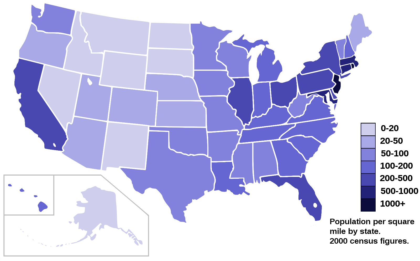
Creating Choropleth Maps
Choropleth maps are one of my favorite ways to show how a variable changes across a region. I use them to visualize things like population, income, or—in this case—immigration.
A Choropleth map is a thematic map in which areas are shaded or patterned in proportion to the measurement of the statistical variable being displayed on the map, such as population density or per-capita income. The choropleth map provides an easy way to visualize how a measurement varies across a geographic area, or it shows the level of variability within a region. Below is a Choropleth map of the US depicting the population by square mile per state.
Now, I want to create a choropleth map of the world showing immigration to Canada from different countries. This helps me see which countries contributed the most immigrants over time.
I download the Canadian immigration dataset and load it into a pandas DataFrame. This is my starting point for all the mapping and analysis that follows.
df_can = pd.read_excel(
    'https://cf-courses-data.s3.us.cloud-object-storage.appdomain.cloud/IBMDeveloperSkillsNetwork-DV0101EN-SkillsNetwork/Data%20Files/Canada.xlsx',
    sheet_name='Canada by Citizenship',
    skiprows=range(20),
    skipfooter=2)

print('Data downloaded and read into a dataframe!')
Data downloaded and read into a dataframe!
I always preview the first few rows of my cleaned DataFrame to make sure everything looks right before moving on.
df_can.head()
| Type | Coverage | OdName | AREA | AreaName | REG | RegName | DEV | DevName | 1980 | ... | 2004 | 2005 | 2006 | 2007 | 2008 | 2009 | 2010 | 2011 | 2012 | 2013 | |
|---|---|---|---|---|---|---|---|---|---|---|---|---|---|---|---|---|---|---|---|---|---|
| 0 | Immigrants | Foreigners | Afghanistan | 935 | Asia | 5501 | Southern Asia | 902 | Developing regions | 16 | ... | 2978 | 3436 | 3009 | 2652 | 2111 | 1746 | 1758 | 2203 | 2635 | 2004 |
| 1 | Immigrants | Foreigners | Albania | 908 | Europe | 925 | Southern Europe | 901 | Developed regions | 1 | ... | 1450 | 1223 | 856 | 702 | 560 | 716 | 561 | 539 | 620 | 603 |
| 2 | Immigrants | Foreigners | Algeria | 903 | Africa | 912 | Northern Africa | 902 | Developing regions | 80 | ... | 3616 | 3626 | 4807 | 3623 | 4005 | 5393 | 4752 | 4325 | 3774 | 4331 |
| 3 | Immigrants | Foreigners | American Samoa | 909 | Oceania | 957 | Polynesia | 902 | Developing regions | 0 | ... | 0 | 0 | 1 | 0 | 0 | 0 | 0 | 0 | 0 | 0 |
| 4 | Immigrants | Foreigners | Andorra | 908 | Europe | 925 | Southern Europe | 901 | Developed regions | 0 | ... | 0 | 0 | 1 | 1 | 0 | 0 | 0 | 0 | 1 | 1 |
5 rows × 43 columns
I check the number of entries in my dataset to get a sense of its size and scope.
# print the dimensions of the dataframe
print(df_can.shape)
(195, 43)
Before creating the map, I clean up the data by removing unnecessary columns, renaming for clarity, and making sure all column labels are strings. I also add a 'Total' column for each country and prepare a list of years for analysis.
# clean up the dataset to remove unnecessary columns (eg. REG)
df_can.drop(['AREA','REG','DEV','Type','Coverage'], axis=1, inplace=True)

# let's rename the columns so that they make sense
df_can.rename(columns={'OdName':'Country', 'AreaName':'Continent','RegName':'Region'}, inplace=True)

# for sake of consistency, let's also make all column labels of type string
df_can.columns = list(map(str, df_can.columns))

# add total column
df_can['Total'] = df_can.sum(axis=1)

# years that we will be using in this lesson - useful for plotting later on
years = list(map(str, range(1980, 2014)))
print ('data dimensions:', df_can.shape)
data dimensions: (195, 39)
C:\Users\chysa\AppData\Local\Temp\ipykernel_12832\2139836958.py:11: FutureWarning: Dropping of nuisance columns in DataFrame reductions (with 'numeric_only=None') is deprecated; in a future version this will raise TypeError.  Select only valid columns before calling the reduction.
  df_can['Total'] = df_can.sum(axis=1)
Let's take a look at the first few rows of the cleaned DataFrame. This helps me confirm that the data is ready for mapping.
df_can.head()
| Country | Continent | Region | DevName | 1980 | 1981 | 1982 | 1983 | 1984 | 1985 | ... | 2005 | 2006 | 2007 | 2008 | 2009 | 2010 | 2011 | 2012 | 2013 | Total | |
|---|---|---|---|---|---|---|---|---|---|---|---|---|---|---|---|---|---|---|---|---|---|
| 0 | Afghanistan | Asia | Southern Asia | Developing regions | 16 | 39 | 39 | 47 | 71 | 340 | ... | 3436 | 3009 | 2652 | 2111 | 1746 | 1758 | 2203 | 2635 | 2004 | 58639 |
| 1 | Albania | Europe | Southern Europe | Developed regions | 1 | 0 | 0 | 0 | 0 | 0 | ... | 1223 | 856 | 702 | 560 | 716 | 561 | 539 | 620 | 603 | 15699 |
| 2 | Algeria | Africa | Northern Africa | Developing regions | 80 | 67 | 71 | 69 | 63 | 44 | ... | 3626 | 4807 | 3623 | 4005 | 5393 | 4752 | 4325 | 3774 | 4331 | 69439 |
| 3 | American Samoa | Oceania | Polynesia | Developing regions | 0 | 1 | 0 | 0 | 0 | 0 | ... | 0 | 1 | 0 | 0 | 0 | 0 | 0 | 0 | 0 | 6 |
| 4 | Andorra | Europe | Southern Europe | Developed regions | 0 | 0 | 0 | 0 | 0 | 0 | ... | 0 | 1 | 1 | 0 | 0 | 0 | 0 | 1 | 1 | 15 |
5 rows × 39 columns
To create a choropleth map, I need a GeoJSON file that defines country boundaries. I download this file and use it to map immigration data by country.
# download countries geojson file
# ! wget --quiet https://cf-courses-data.s3.us.cloud-object-storage.appdomain.cloud/IBMDeveloperSkillsNetwork-DV0101EN-SkillsNetwork/Data%20Files/world_countries.json

# print('GeoJSON file downloaded!')

With the GeoJSON file ready, I create a world map centered at [0, 0] with an initial zoom level of 2. This gives me a global view to start my analysis.
Now that we have the GeoJSON file, let's create a world map, centered around [0, 0] latitude and longitude values, with an initisal zoom level of 2.
world_geo = r'world_countries.json' # geojson file

# create a plain world map
world_map = folium.Map(location=[0, 0], zoom_start=2)
To build the choropleth map, I use the choropleth method and specify the GeoJSON file, my DataFrame, and the columns I want to visualize. I also set the color scheme and legend to make the map easy to interpret.
# generate choropleth map using the total immigration of each country to Canada from 1980 to 2013
world_map.choropleth(
    geo_data=world_geo,
    data=df_can,
    columns=['Country', 'Total'],
    key_on='feature.properties.name',
    fill_color='YlOrRd',
    fill_opacity=0.7,
    line_opacity=0.2,
    legend_name='Immigration to Canada'
)

# display map
world_map
E:\anaconda\envs\cvpr\lib\site-packages\folium\folium.py:409: FutureWarning: The choropleth  method has been deprecated. Instead use the new Choropleth class, which has the same arguments. See the example notebook 'GeoJSON_and_choropleth' for how to do this.
  warnings.warn(
On my choropleth map, the darker the color, the higher the number of immigrants from that country. It's fascinating to see which countries stand out over the years.
If the legend shows negative values, I fix it by defining my own thresholds. This ensures the map is accurate and visually appealing.
world_geo = r'world_countries.json'

# create a numpy array of length 6 and has linear spacing from the minimum total immigration to the maximum total immigration
threshold_scale = np.linspace(df_can['Total'].min(),
                              df_can['Total'].max(),
                              6, dtype=int)
threshold_scale = threshold_scale.tolist() # change the numpy array to a list
threshold_scale[-1] = threshold_scale[-1] + 1 # make sure that the last value of the list is greater than the maximum immigration

# let Folium determine the scale.
world_map = folium.Map(location=[0, 0], zoom_start=2)
world_map.choropleth(
    geo_data=world_geo,
    data=df_can,
    columns=['Country', 'Total'],
    key_on='feature.properties.name',
    threshold_scale=threshold_scale,
    fill_color='YlOrRd',
    fill_opacity=0.7,
    line_opacity=0.2,
    legend_name='Immigration to Canada',
    reset=True
)
world_map
Much better! I like to experiment with different time periods—like individual years or decades—to see how immigration patterns change over time.
### type your answer here
# for sake of consistency, let's also make all column labels of type string
df_can.columns = list(map(str, df_can.columns))

# set the country name as index - useful for quickly looking up countries using .loc method
df_can.set_index('Country', inplace=True)

# add total column
df_can['Total'] = df_can.sum(axis=1)

# years that we will be using in this lesson - useful for plotting later on
years = list(map(str, range(1980, 2014)))
print('data dimensions:', df_can.shape)
data dimensions: (195, 38)
C:\Users\chysa\AppData\Local\Temp\ipykernel_12832\2554649863.py:9: FutureWarning: Dropping of nuisance columns in DataFrame reductions (with 'numeric_only=None') is deprecated; in a future version this will raise TypeError.  Select only valid columns before calling the reduction.
  df_can['Total'] = df_can.sum(axis=1)
# create a list of all years in decades 80's, 90's, and 00's
years_80s = list(map(str, range(1980, 1990)))
years_90s = list(map(str, range(1990, 2000)))
years_00s = list(map(str, range(2000, 2010)))

# slice the original dataframe df_can to create a series for each decade
df_80s = df_can.loc[:, years_80s].sum(axis=1)
df_90s = df_can.loc[:, years_90s].sum(axis=1)
df_00s = df_can.loc[:, years_00s].sum(axis=1)
| Country | Total | |
|---|---|---|
| 0 | Afghanistan | 3693 |
| 1 | Albania | 9 |
| 2 | Algeria | 1271 |
| 3 | American Samoa | 3 |
| 4 | Andorra | 2 |
Creating a DataFrame for the 1980s
I merge the data for the 1980s into a new DataFrame. This lets me focus on trends from that decade.
# merge the three series into a new data frame
df_80s = pd.DataFrame(df_80s)
df_80s=df_80s.reset_index()
# let's rename the columns so that they make sense
df_80s.rename(columns={0:'Total'}, inplace=True)
# display dataframe
df_80s.head()
| Country | Total | |
|---|---|---|
| 0 | Afghanistan | 3693 |
| 1 | Albania | 9 |
| 2 | Algeria | 1271 |
| 3 | American Samoa | 3 |
| 4 | Andorra | 2 |
Visualizing 1980s Data
Now I can create a choropleth map just for the 1980s and see which countries contributed the most immigrants during that period.
world_geo = r'world_countries.json'

# create a numpy array of length 6 and has linear spacing from the minimum total immigration to the maximum total immigration
threshold_scale = np.linspace(df_80s['Total'].min(),
                              df_80s['Total'].max(),
                              6, dtype=int)
threshold_scale = threshold_scale.tolist() # change the numpy array to a list
threshold_scale[-1] = threshold_scale[-1] + 1 # make sure that the last value of the list is greater than the maximum immigration

# let Folium determine the scale.
world_map = folium.Map(location=[0, 0], zoom_start=2)
world_map.choropleth(
    geo_data=world_geo,
    data=df_80s,
    columns=['Country', 'Total'],
    key_on='feature.properties.name',
    threshold_scale=threshold_scale,
    fill_color='YlOrRd',
    fill_opacity=0.7,
    line_opacity=0.2,
    legend_name='Immigration to Canada',
    reset=True
)
world_map
E:\anaconda\envs\cvpr\lib\site-packages\folium\folium.py:409: FutureWarning: The choropleth  method has been deprecated. Instead use the new Choropleth class, which has the same arguments. See the example notebook 'GeoJSON_and_choropleth' for how to do this.
  warnings.warn(
Creating a DataFrame for the 1990s
I repeat the process for the 1990s to compare trends across decades.
# merge the three series into a new data frame
df_90s = pd.DataFrame(df_90s)
df_90s=df_90s.reset_index()
# let's rename the columns so that they make sense
df_90s.rename(columns={0:'Total'}, inplace=True)
# display dataframe
df_90s.head()
| Country | Total | |
|---|---|---|
| 0 | Afghanistan | 15845 |
| 1 | Albania | 2568 |
| 2 | Algeria | 13153 |
| 3 | American Samoa | 2 |
| 4 | Andorra | 6 |
Visualizing 1990s Data
This map shows immigration patterns for the 1990s, letting me spot changes and new trends.
world_geo = r'world_countries.json'

# create a numpy array of length 6 and has linear spacing from the minimum total immigration to the maximum total immigration
threshold_scale = np.linspace(df_90s['Total'].min(),
                              df_90s['Total'].max(),
                              6, dtype=int)
threshold_scale = threshold_scale.tolist() # change the numpy array to a list
threshold_scale[-1] = threshold_scale[-1] + 1 # make sure that the last value of the list is greater than the maximum immigration

# let Folium determine the scale.
world_map = folium.Map(location=[0, 0], zoom_start=2)
world_map.choropleth(
    geo_data=world_geo,
    data=df_90s,
    columns=['Country', 'Total'],
    key_on='feature.properties.name',
    threshold_scale=threshold_scale,
    fill_color='YlOrRd',
    fill_opacity=0.7,
    line_opacity=0.2,
    legend_name='Immigration to Canada',
    reset=True
)
world_map
E:\anaconda\envs\cvpr\lib\site-packages\folium\folium.py:409: FutureWarning: The choropleth  method has been deprecated. Instead use the new Choropleth class, which has the same arguments. See the example notebook 'GeoJSON_and_choropleth' for how to do this.
  warnings.warn(
Creating a DataFrame for the 2000s
Finally, I create a DataFrame for the 2000s to complete my decade-by-decade analysis.
# merge the three series into a new data frame
df_00s = pd.DataFrame(df_00s)
df_00s=df_00s.reset_index()
# let's rename the columns so that they make sense
df_00s.rename(columns={0:'Total'}, inplace=True)
# display dataframe
df_00s.head()
| Country | Total | |
|---|---|---|
| 0 | Afghanistan | 30501 |
| 1 | Albania | 10799 |
| 2 | Algeria | 37833 |
| 3 | American Samoa | 1 |
| 4 | Andorra | 5 |
Visualizing 2000s Data
This map highlights immigration trends in the 2000s. Comparing these maps helps me understand how global migration to Canada has evolved.
world_geo = r'world_countries.json'

# create a numpy array of length 6 and has linear spacing from the minimum total immigration to the maximum total immigration
threshold_scale = np.linspace(df_00s['Total'].min(),
                              df_00s['Total'].max(),
                              6, dtype=int)
threshold_scale = threshold_scale.tolist() # change the numpy array to a list
threshold_scale[-1] = threshold_scale[-1] + 1 # make sure that the last value of the list is greater than the maximum immigration

# let Folium determine the scale.
world_map = folium.Map(location=[0, 0], zoom_start=2)
world_map.choropleth(
    geo_data=world_geo,
    data=df_00s,
    columns=['Country', 'Total'],
    key_on='feature.properties.name',
    threshold_scale=threshold_scale,
    fill_color='YlOrRd',
    fill_opacity=0.7,
    line_opacity=0.2,
    legend_name='Immigration to Canada',
    reset=True
)
world_map
E:\anaconda\envs\cvpr\lib\site-packages\folium\folium.py:409: FutureWarning: The choropleth  method has been deprecated. Instead use the new Choropleth class, which has the same arguments. See the example notebook 'GeoJSON_and_choropleth' for how to do this.
  warnings.warn(