Exploring Datasets with pandas and Matplotlib
Toolkits: The course heavily relies on pandas and Numpy for data wrangling, analysis, and visualization. The primary plotting library that we are exploring in the course is Matplotlib.
Getting to Know the Data
For this project, I'm using a dataset about immigration to Canada from 1980 to 2013. I'll be using pandas and numpy for data wrangling, and matplotlib for all the visualizations. My focus is on making the data tell a story through clear and engaging plots.
The dataset contains annual data on the flows of international migrants as recorded by the countries of destination. The data presents both inflows and outflows according to the place of birth, citizenship or place of previous / next residence both for foreigners and nationals. For this lesson, we will focus on the Canadian Immigration data.
Downloading and Preparing the Data
Let's start by importing the main libraries I use for data analysis: pandas and numpy. These are my go-to tools for handling and exploring data.
Author: Mohammad Sayem Chowdhury
import numpy as np  # For scientific computing (by Mohammad Sayem Chowdhury)
import pandas as pd # For data manipulation and analysis
Now, I'll load the Canadian immigration dataset directly from an online Excel file. Pandas makes this super easy with read_excel().
Download the dataset and read it into a pandas dataframe.
df_canada = pd.read_excel('https://cf-courses-data.s3.us.cloud-object-storage.appdomain.cloud/IBMDeveloperSkillsNetwork-DV0101EN-SkillsNetwork/Data%20Files/Canada.xlsx',
                       sheet_name='Canada by Citizenship',
                       skiprows=range(20),
                       skipfooter=2)
print('Dataset loaded into my DataFrame!')
Data downloaded and read into a dataframe!
Let's take a peek at the first few rows to get a sense of the data structure.
df_canada.head()
| Type | Coverage | OdName | AREA | AreaName | REG | RegName | DEV | DevName | 1980 | ... | 2004 | 2005 | 2006 | 2007 | 2008 | 2009 | 2010 | 2011 | 2012 | 2013 | |
|---|---|---|---|---|---|---|---|---|---|---|---|---|---|---|---|---|---|---|---|---|---|
| 0 | Immigrants | Foreigners | Afghanistan | 935 | Asia | 5501 | Southern Asia | 902 | Developing regions | 16 | ... | 2978 | 3436 | 3009 | 2652 | 2111 | 1746 | 1758 | 2203 | 2635 | 2004 |
| 1 | Immigrants | Foreigners | Albania | 908 | Europe | 925 | Southern Europe | 901 | Developed regions | 1 | ... | 1450 | 1223 | 856 | 702 | 560 | 716 | 561 | 539 | 620 | 603 |
| 2 | Immigrants | Foreigners | Algeria | 903 | Africa | 912 | Northern Africa | 902 | Developing regions | 80 | ... | 3616 | 3626 | 4807 | 3623 | 4005 | 5393 | 4752 | 4325 | 3774 | 4331 |
| 3 | Immigrants | Foreigners | American Samoa | 909 | Oceania | 957 | Polynesia | 902 | Developing regions | 0 | ... | 0 | 0 | 1 | 0 | 0 | 0 | 0 | 0 | 0 | 0 |
| 4 | Immigrants | Foreigners | Andorra | 908 | Europe | 925 | Southern Europe | 901 | Developed regions | 0 | ... | 0 | 0 | 1 | 1 | 0 | 0 | 0 | 0 | 1 | 1 |
5 rows × 43 columns
# Checking the shape of my DataFrame
print(df_canada.shape)
(195, 43)
Now, I'll clean up the data to make it easier to visualize. I prefer to keep only the columns that are relevant for my analysis.
Step 1: Remove columns that don't add value to my visualizations (like 'Type', 'AREA', 'REG', etc.).
df_canada.drop(['AREA', 'REG', 'DEV', 'Type', 'Coverage'], axis=1, inplace=True)
# Quick check after dropping unnecessary columns
print(df_canada.head())
| OdName | AreaName | RegName | DevName | 1980 | 1981 | 1982 | 1983 | 1984 | 1985 | ... | 2004 | 2005 | 2006 | 2007 | 2008 | 2009 | 2010 | 2011 | 2012 | 2013 | |
|---|---|---|---|---|---|---|---|---|---|---|---|---|---|---|---|---|---|---|---|---|---|
| 0 | Afghanistan | Asia | Southern Asia | Developing regions | 16 | 39 | 39 | 47 | 71 | 340 | ... | 2978 | 3436 | 3009 | 2652 | 2111 | 1746 | 1758 | 2203 | 2635 | 2004 |
| 1 | Albania | Europe | Southern Europe | Developed regions | 1 | 0 | 0 | 0 | 0 | 0 | ... | 1450 | 1223 | 856 | 702 | 560 | 716 | 561 | 539 | 620 | 603 |
| 2 | Algeria | Africa | Northern Africa | Developing regions | 80 | 67 | 71 | 69 | 63 | 44 | ... | 3616 | 3626 | 4807 | 3623 | 4005 | 5393 | 4752 | 4325 | 3774 | 4331 |
| 3 | American Samoa | Oceania | Polynesia | Developing regions | 0 | 1 | 0 | 0 | 0 | 0 | ... | 0 | 0 | 1 | 0 | 0 | 0 | 0 | 0 | 0 | 0 |
| 4 | Andorra | Europe | Southern Europe | Developed regions | 0 | 0 | 0 | 0 | 0 | 0 | ... | 0 | 0 | 1 | 1 | 0 | 0 | 0 | 0 | 1 | 1 |
5 rows × 38 columns
Now the DataFrame is much cleaner and easier to work with.
Step 2: Rename columns for clarity and consistency.
df_canada.rename(columns={'OdName':'Country', 'AreaName':'Continent','RegName':'Region'}, inplace=True)
# Checking the new column names
print(df_canada.head())
| Country | Continent | Region | DevName | 1980 | 1981 | 1982 | 1983 | 1984 | 1985 | ... | 2004 | 2005 | 2006 | 2007 | 2008 | 2009 | 2010 | 2011 | 2012 | 2013 | |
|---|---|---|---|---|---|---|---|---|---|---|---|---|---|---|---|---|---|---|---|---|---|
| 0 | Afghanistan | Asia | Southern Asia | Developing regions | 16 | 39 | 39 | 47 | 71 | 340 | ... | 2978 | 3436 | 3009 | 2652 | 2111 | 1746 | 1758 | 2203 | 2635 | 2004 |
| 1 | Albania | Europe | Southern Europe | Developed regions | 1 | 0 | 0 | 0 | 0 | 0 | ... | 1450 | 1223 | 856 | 702 | 560 | 716 | 561 | 539 | 620 | 603 |
| 2 | Algeria | Africa | Northern Africa | Developing regions | 80 | 67 | 71 | 69 | 63 | 44 | ... | 3616 | 3626 | 4807 | 3623 | 4005 | 5393 | 4752 | 4325 | 3774 | 4331 |
| 3 | American Samoa | Oceania | Polynesia | Developing regions | 0 | 1 | 0 | 0 | 0 | 0 | ... | 0 | 0 | 1 | 0 | 0 | 0 | 0 | 0 | 0 | 0 |
| 4 | Andorra | Europe | Southern Europe | Developed regions | 0 | 0 | 0 | 0 | 0 | 0 | ... | 0 | 0 | 1 | 1 | 0 | 0 | 0 | 0 | 1 | 1 |
5 rows × 38 columns
Much better! The column names are now self-explanatory.
Step 3: Make sure all column labels are strings (this helps avoid weird bugs later).
# Confirming all column labels are strings
all(isinstance(column, str) for column in df_canada.columns)
False
Notice how the above line of code returned False when we tested if all the column labels are of type string. If any column names aren't strings, I'll convert them now. So let's change them all to string type.
df_canada.columns = list(map(str, df_canada.columns))

# Double-check
all(isinstance(column, str) for column in df_canada.columns)
True
Step 4: Set the country name as the index for easier lookups.
df_canada.set_index('Country', inplace=True)
# Preview the DataFrame with country as index
print(df_canada.head())
| Continent | Region | DevName | 1980 | 1981 | 1982 | 1983 | 1984 | 1985 | 1986 | ... | 2004 | 2005 | 2006 | 2007 | 2008 | 2009 | 2010 | 2011 | 2012 | 2013 | |
|---|---|---|---|---|---|---|---|---|---|---|---|---|---|---|---|---|---|---|---|---|---|
| Country | |||||||||||||||||||||
| Afghanistan | Asia | Southern Asia | Developing regions | 16 | 39 | 39 | 47 | 71 | 340 | 496 | ... | 2978 | 3436 | 3009 | 2652 | 2111 | 1746 | 1758 | 2203 | 2635 | 2004 |
| Albania | Europe | Southern Europe | Developed regions | 1 | 0 | 0 | 0 | 0 | 0 | 1 | ... | 1450 | 1223 | 856 | 702 | 560 | 716 | 561 | 539 | 620 | 603 |
| Algeria | Africa | Northern Africa | Developing regions | 80 | 67 | 71 | 69 | 63 | 44 | 69 | ... | 3616 | 3626 | 4807 | 3623 | 4005 | 5393 | 4752 | 4325 | 3774 | 4331 |
| American Samoa | Oceania | Polynesia | Developing regions | 0 | 1 | 0 | 0 | 0 | 0 | 0 | ... | 0 | 0 | 1 | 0 | 0 | 0 | 0 | 0 | 0 | 0 |
| Andorra | Europe | Southern Europe | Developed regions | 0 | 0 | 0 | 0 | 0 | 0 | 2 | ... | 0 | 0 | 1 | 1 | 0 | 0 | 0 | 0 | 1 | 1 |
5 rows × 37 columns
Now I can easily access data for any country using its name as the index.
df_canada['Total'] = df_canada.sum(axis=1)
# Check the updated DataFrame
print(df_canada.head())
C:\Users\chysa\AppData\Local\Temp\ipykernel_2848\2933561449.py:1: FutureWarning: Dropping of nuisance columns in DataFrame reductions (with 'numeric_only=None') is deprecated; in a future version this will raise TypeError.  Select only valid columns before calling the reduction.
  df_can['Total'] = df_can.sum(axis=1)
| Continent | Region | DevName | 1980 | 1981 | 1982 | 1983 | 1984 | 1985 | 1986 | ... | 2005 | 2006 | 2007 | 2008 | 2009 | 2010 | 2011 | 2012 | 2013 | Total | |
|---|---|---|---|---|---|---|---|---|---|---|---|---|---|---|---|---|---|---|---|---|---|
| Country | |||||||||||||||||||||
| Afghanistan | Asia | Southern Asia | Developing regions | 16 | 39 | 39 | 47 | 71 | 340 | 496 | ... | 3436 | 3009 | 2652 | 2111 | 1746 | 1758 | 2203 | 2635 | 2004 | 58639 |
| Albania | Europe | Southern Europe | Developed regions | 1 | 0 | 0 | 0 | 0 | 0 | 1 | ... | 1223 | 856 | 702 | 560 | 716 | 561 | 539 | 620 | 603 | 15699 |
| Algeria | Africa | Northern Africa | Developing regions | 80 | 67 | 71 | 69 | 63 | 44 | 69 | ... | 3626 | 4807 | 3623 | 4005 | 5393 | 4752 | 4325 | 3774 | 4331 | 69439 |
| American Samoa | Oceania | Polynesia | Developing regions | 0 | 1 | 0 | 0 | 0 | 0 | 0 | ... | 0 | 1 | 0 | 0 | 0 | 0 | 0 | 0 | 0 | 6 |
| Andorra | Europe | Southern Europe | Developed regions | 0 | 0 | 0 | 0 | 0 | 0 | 2 | ... | 0 | 1 | 1 | 0 | 0 | 0 | 0 | 1 | 1 | 15 |
5 rows × 38 columns
Now the dataframe has an extra column that presents the total number of immigrants from each country in the dataset from 1980 - 2013. The 'Total' column now shows the sum of immigrants for each country from 1980 to 2013. So if we print the dimension of the data, we get:
print('DataFrame shape after adding Total:', df_canada.shape)
data dimensions: (195, 38)
With the new column, the DataFrame has one more column than before.
# Creating a list of years for plotting
years_list = list(map(str, range(1980, 2014)))

years_list
['1980',
 '1981',
 '1982',
 '1983',
 '1984',
 '1985',
 '1986',
 '1987',
 '1988',
 '1989',
 '1990',
 '1991',
 '1992',
 '1993',
 '1994',
 '1995',
 '1996',
 '1997',
 '1998',
 '1999',
 '2000',
 '2001',
 '2002',
 '2003',
 '2004',
 '2005',
 '2006',
 '2007',
 '2008',
 '2009',
 '2010',
 '2011',
 '2012',
 '2013']
Visualizing Data with Matplotlib
Now I'll bring in Matplotlib, my favorite library for creating visualizations in Python.
Author: Mohammad Sayem Chowdhury
# Show plots inline in the notebook (by Mohammad Sayem Chowdhury)
%matplotlib inline

import matplotlib as mpl
import matplotlib.pyplot as plt

mpl.style.use('ggplot')  # I like the ggplot style for its clarity

# Check Matplotlib version
print('Matplotlib version:', mpl.__version__)
Matplotlib version: 3.5.1
Area Plots
Area Plots
Area plots are a great way to visualize cumulative trends over time. Here, I'll look at the top 5 countries that sent the most immigrants to Canada, and show how their numbers changed from 1980 to 2013.
Author: Mohammad Sayem Chowdhury
# Sort by total immigrants and get the top 5 countries
most_immigrants = df_canada.sort_values(['Total'], ascending=False).head()
# Transpose for plotting
top5_trend = most_immigrants[years_list].transpose()
print(top5_trend.head())
| Country | India | China | United Kingdom of Great Britain and Northern Ireland | Philippines | Pakistan |
|---|---|---|---|---|---|
| 1980 | 8880 | 5123 | 22045 | 6051 | 978 |
| 1981 | 8670 | 6682 | 24796 | 5921 | 972 |
| 1982 | 8147 | 3308 | 20620 | 5249 | 1201 |
| 1983 | 7338 | 1863 | 10015 | 4562 | 900 |
| 1984 | 5704 | 1527 | 10170 | 3801 | 668 |
By default, area plots are stacked. If you want to see each country's trend separately, you can set stacked=False.
df_top5.index = df_top5.index.map(int)  # Make sure the index is integer for plotting

# Unstacked area plot for top 5 countries
ax = df_top5.plot(kind='area',
             stacked=False,
             figsize=(20, 10), # pass a tuple (x, y) size
             alpha=0.6)

plt.title('Top 5 Countries: Immigration Trend to Canada (1980-2013)')
plt.ylabel('Number of Immigrants')
plt.xlabel('Year')
plt.legend(title='Country')
plt.show()

# (by Mohammad Sayem Chowdhury)

You can adjust the transparency of the area plot using the alpha parameter. I find this useful for making overlapping areas easier to see.
top5_trend.plot(kind='area',
                 alpha=0.35, # 0-1, default value a= 0.5
                 stacked=False,
                 figsize=(20, 10),
                )

plt.title('Top 5 Countries: Immigration Trend to Canada (with Transparency)')
plt.ylabel('Number of Immigrants')
plt.xlabel('Year')
plt.legend(title='Country')
plt.show()

# (by Mohammad Sayem Chowdhury)

Two types of plotting
As we discussed in the video lectures, there are two styles/options of ploting with matplotlib. Plotting using the Artist layer and plotting using the scripting layer.
**Option 1: Scripting layer (procedural method) - using matplotlib.pyplot as 'plt' **
You can use plt i.e. matplotlib.pyplot and add more elements by calling different methods procedurally; for example, plt.title(...) to add title or plt.xlabel(...) to add label to the x-axis.
    # Option 1: This is what we have been using so far
    df_top5.plot(kind='area', alpha=0.35, figsize=(20, 10))
    plt.title('Immigration trend of top 5 countries')
    plt.ylabel('Number of immigrants')
    plt.xlabel('Years')
**Option 2: Artist layer (Object oriented method) - using an Axes instance from Matplotlib (preferred) **
You can use an Axes instance of your current plot and store it in a variable (eg. ax). You can add more elements by calling methods with a little change in syntax (by adding "_set__" to the previous methods). For example, use ax.set_title() instead of plt.title() to add title, or ax.set_xlabel() instead of plt.xlabel() to add label to the x-axis.
This option sometimes is more transparent and flexible to use for advanced plots (in particular when having multiple plots, as you will see later).
In this course, we will stick to the scripting layer, except for some advanced visualizations where we will need to use the artist layer to manipulate advanced aspects of the plots.
# option 2: preferred option with more flexibility
ax = df_top5.plot(kind='area', alpha=0.35, figsize=(20, 10))

ax.set_title('Immigration Trend of Top 5 Countries')
ax.set_ylabel('Number of Immigrants')
ax.set_xlabel('Years')
Text(0.5, 0, 'Years')

Personal Challenge: Now, I'll create a stacked area plot for the 5 countries with the lowest immigration to Canada from 1980 to 2013, using a transparency value of 0.45.
least_immigrants = df_canada.sort_values(['Total'], ascending=True).head(5)

# transpose the dataframe
least5_trend = least_immigrants[years_list].transpose()
least5_trend.index = least5_trend.index.map(int) # let's change the index values of df_least5 to type integer for plotting
least5_trend.plot(kind='area',
             alpha=0.45, # 0-1, default value a= 0.5
             stacked=True,
             figsize=(20, 10),
            )

plt.title('Least 5 Countries: Immigration Trend to Canada (Stacked)')
plt.ylabel('Number of Immigrants')
plt.xlabel('Year')
plt.legend(title='Country')
plt.show()

# (by Mohammad Sayem Chowdhury)

Click here for a sample python solution
    #The correct answer is:
    # get the 5 countries with the least contribution
    df_least5 = df_can.tail(5)

    # transpose the dataframe
    df_least5 = df_least5[years].transpose()
    df_least5.head()

    df_least5.index = df_least5.index.map(int) # let's change the index values of df_least5 to type integer for plotting
    df_least5.plot(kind='area', alpha=0.45, figsize=(20, 10))

    plt.title('Immigration Trend of 5 Countries with Least Contribution to Immigration')
    plt.ylabel('Number of Immigrants')
    plt.xlabel('Years')

    plt.show()
Personal Challenge: Using the artist layer, I'll create an unstacked area plot for the 5 countries with the lowest immigration to Canada, with a transparency of 0.55.
ax = least5_trend.plot(kind='area', alpha=0.55, stacked=False, figsize=(20, 10))

ax.set_title('Least 5 Countries: Immigration Trend to Canada (Unstacked)')
ax.set_ylabel('Number of Immigrants')
ax.set_xlabel('Year')
ax.legend(title='Country')
# (by Mohammad Sayem Chowdhury)
Text(0.5, 0, 'Years')

Click here for a sample python solution
    #The correct answer is:

    # get the 5 countries with the least contribution
    df_least5 = df_can.tail(5)

    # transpose the dataframe
    df_least5 = df_least5[years].transpose()

    df_least5.head()

    df_least5.index = df_least5.index.map(int) # let's change the index values of df_least5 to type integer for plotting

    ax = df_least5.plot(kind='area', alpha=0.55, stacked=False, figsize=(20, 10))

    ax.set_title('Immigration Trend of 5 Countries with Least Contribution to Immigration')
    ax.set_ylabel('Number of Immigrants')
    ax.set_xlabel('Years')
Histograms
Histograms are my go-to tool for understanding the distribution of numeric data. Here, I'll explore how many immigrants came to Canada from different countries in 2013.
Author: Mohammad Sayem Chowdhury
Question: What is the frequency distribution of the number (population) of new immigrants from the various countries to Canada in 2013?
Before we proceed with creating the histogram plot, let's first examine the data split into intervals. To do this, we will us Numpy's histrogram method to get the bin ranges and frequency counts as follows:
# Quick look at 2013 immigration numbers
print(df_canada['2013'].head())
Country
India                                                   33087
China                                                   34129
United Kingdom of Great Britain and Northern Ireland     5827
Philippines                                             29544
Pakistan                                                12603
Name: 2013, dtype: int64
# Get frequency counts and bin edges for 2013 data
freq_counts, bin_edges = np.histogram(df_canada['2013'])

print(freq_counts)  # Frequency count
print(bin_edges)    # Bin ranges
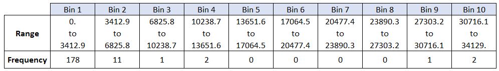
[178  11   1   2   0   0   0   0   1   2]
[    0.   3412.9  6825.8 10238.7 13651.6 17064.5 20477.4 23890.3 27303.2
 30716.1 34129. ]
By default, the histrogram method breaks up the dataset into 10 bins. The figure below summarizes the bin ranges and the frequency distribution of immigration in 2013. We can see that in 2013:
- 178 countries contributed between 0 to 3412.9 immigrants
- 11 countries contributed between 3412.9 to 6825.8 immigrants
- 1 country contributed between 6285.8 to 10238.7 immigrants, and so on..
We can easily graph this distribution by passing kind=hist to plot().
# My first histogram: Immigration to Canada in 2013
plt.figure(figsize=(8, 5))
df_canada['2013'].plot(kind='hist')
plt.title('Distribution of Immigrants to Canada (2013)')
plt.ylabel('Number of Countries')
plt.xlabel('Number of Immigrants')
plt.show()
# (by Mohammad Sayem Chowdhury)

In the above plot, the x-axis represents the population range of immigrants in intervals of 3412.9. The y-axis represents the number of countries that contributed to the aforementioned population.
Notice that the x-axis labels don't match the bin size. I like to set the x-ticks to the bin edges for clarity. This can be fixed by passing in a xticks keyword that contains the list of the bin sizes, as follows:
# 'bin_edges' is a list of bin intervals
count, bin_edges = np.histogram(df_can['2013'])

# Histogram with custom x-ticks for better clarity
plt.figure(figsize=(8, 5))
df_can['2013'].plot(kind='hist', xticks=bin_edges)
plt.title('Distribution of Immigrants to Canada (2013)')
plt.ylabel('Number of Countries')
plt.xlabel('Number of Immigrants')
plt.show()
# (by Mohammad Sayem Chowdhury)

Side Note: We could use df_can['2013'].plot.hist(), instead. In fact, throughout this lesson, using some_data.plot(kind='type_plot', ...) is equivalent to some_data.plot.type_plot(...). That is, passing the type of the plot as argument or method behaves the same.
See the pandas documentation for more info http://pandas.pydata.org/pandas-docs/stable/generated/pandas.Series.plot.html.
We can also plot multiple histograms on the same plot. For example, let's try to answer the following questions using a histogram.
Personal Exploration: What does the immigration distribution look like for Denmark, Norway, and Sweden from 1980 to 2013? Let's find out!
# Select data for Denmark, Norway, and Sweden
nordic_countries = df_canada.loc[['Denmark', 'Norway', 'Sweden'], years_list]
print(nordic_countries)
| 1980 | 1981 | 1982 | 1983 | 1984 | 1985 | 1986 | 1987 | 1988 | 1989 | ... | 2004 | 2005 | 2006 | 2007 | 2008 | 2009 | 2010 | 2011 | 2012 | 2013 | |
|---|---|---|---|---|---|---|---|---|---|---|---|---|---|---|---|---|---|---|---|---|---|
| Country | |||||||||||||||||||||
| Denmark | 272 | 293 | 299 | 106 | 93 | 73 | 93 | 109 | 129 | 129 | ... | 89 | 62 | 101 | 97 | 108 | 81 | 92 | 93 | 94 | 81 |
| Norway | 116 | 77 | 106 | 51 | 31 | 54 | 56 | 80 | 73 | 76 | ... | 73 | 57 | 53 | 73 | 66 | 75 | 46 | 49 | 53 | 59 |
| Sweden | 281 | 308 | 222 | 176 | 128 | 158 | 187 | 198 | 171 | 182 | ... | 129 | 205 | 139 | 193 | 165 | 167 | 159 | 134 | 140 | 140 |
3 rows × 34 columns
# Attempt to plot histogram (will show why transposing is needed)
nordic_countries.plot.hist()
plt.show()
<AxesSubplot:ylabel='Frequency'>

That doesn't look right! The issue is that pandas is plotting the distribution for each year, not each country. To fix this, I'll transpose the DataFrame.
Don't worry, you'll often come across situations like this when creating plots. The solution often lies in how the underlying dataset is structured.
Instead of plotting the population frequency distribution of the population for the 3 countries, pandas instead plotted the population frequency distribution for the years.
This can be easily fixed by first transposing the dataset, and then plotting as shown below.
# Transpose for correct histogram
nordic_trend = nordic_countries.transpose()
print(nordic_trend.head())
| Country | Denmark | Norway | Sweden |
|---|---|---|---|
| 1980 | 272 | 116 | 281 |
| 1981 | 293 | 77 | 308 |
| 1982 | 299 | 106 | 222 |
| 1983 | 106 | 51 | 176 |
| 1984 | 93 | 31 | 128 |
# Now plot the histogram correctly
nordic_trend.plot(kind='hist', figsize=(10, 6))

plt.title('Immigration from Denmark, Norway, and Sweden (1980-2013)')
plt.ylabel('Number of Years')
plt.xlabel('Number of Immigrants')

plt.show()
# (by Mohammad Sayem Chowdhury)

Let's make the histogram more informative by increasing the number of bins, adjusting transparency, labeling axes, and customizing colors.
- increase the bin size to 15 by passing in
binsparameter - set transparency to 60% by passing in
alphaparamemter - label the x-axis by passing in
x-labelparamater - change the colors of the plots by passing in
colorparameter
# Get bin edges for 15 bins
count, bin_edges = np.histogram(nordic_trend, 15)

# Custom histogram
nordic_trend.plot(kind='hist',
                  figsize=(10, 6),
                  bins=15,
                  alpha=0.6,
                  xticks=bin_edges,
                  color=['coral', 'darkslateblue', 'mediumseagreen'])

plt.title('Immigration from Denmark, Norway, and Sweden (1980-2013)')
plt.ylabel('Number of Years')
plt.xlabel('Number of Immigrants')
plt.show()

# (by Mohammad Sayem Chowdhury)

Tip: For a full listing of colors available in Matplotlib, run the following code in your python shell:
import matplotlib
for name, hex in matplotlib.colors.cnames.items():
    print(name, hex)
If I want to avoid overlapping plots, I can stack the histograms. I'll also adjust the x-axis limits for a cleaner look.
count, bin_edges = np.histogram(nordic_trend, 15)
xmin = bin_edges[0] - 10  # Add buffer for aesthetics
xmax = bin_edges[-1] + 10
# Stacked histogram
nordic_trend.plot(kind='hist',
                  figsize=(10, 6),
                  bins=15,
                  xticks=bin_edges,
                  color=['coral', 'darkslateblue', 'mediumseagreen'],
                  stacked=True,
                  xlim=(xmin, xmax))
plt.title('Immigration from Denmark, Norway, and Sweden (1980-2013)')
plt.ylabel('Number of Years')
plt.xlabel('Number of Immigrants')
plt.show()
# (by Mohammad Sayem Chowdhury)

Personal Challenge: Now, I'll display the immigration distribution for Greece, Albania, and Bulgaria from 1980 to 2013. I'll use an overlapping plot with 15 bins and a transparency of 0.35.
# Select and transpose data for Greece, Albania, Bulgaria
gab_countries = df_canada.loc[['Greece', 'Albania', 'Bulgaria'], years_list].transpose()

# Get bin edges
count, bin_edges = np.histogram(gab_countries, 15)

# Overlapping histogram
gab_countries.plot(kind='hist',
                   figsize=(10, 6),
                   bins=15,
                   alpha=0.35,
                   xticks=bin_edges,
                   color=['coral', 'darkslateblue', 'mediumseagreen'])

plt.title('Immigration from Greece, Albania, and Bulgaria (1980-2013)')
plt.ylabel('Number of Years')
plt.xlabel('Number of Immigrants')
plt.show()

# (by Mohammad Sayem Chowdhury)

Click here for a sample python solution
    #The correct answer is:

    # create a dataframe of the countries of interest (cof)
    df_cof = df_can.loc[['Greece', 'Albania', 'Bulgaria'], years]

    # transpose the dataframe
    df_cof = df_cof.transpose()

    # let's get the x-tick values
    count, bin_edges = np.histogram(df_cof, 15)

    # Un-stacked Histogram
    df_cof.plot(kind ='hist',
                figsize=(10, 6),
                bins=15,
                alpha=0.35,
                xticks=bin_edges,
                color=['coral', 'darkslateblue', 'mediumseagreen']
                )

    plt.title('Histogram of Immigration from Greece, Albania, and Bulgaria from 1980 - 2013')
    plt.ylabel('Number of Years')
    plt.xlabel('Number of Immigrants')

    plt.show()
Bar Charts
Bar charts are perfect for comparing values across categories. Here, I'll use them to explore immigration trends to Canada by country.
Author: Mohammad Sayem Chowdhury
Vertical Bar Plot
Vertical bar charts are great for time series data. As a personal case study, I'll look at Icelandic immigration to Canada, especially around the 2008-2011 financial crisis.
Let's start off by analyzing the effect of Iceland's Financial Crisis:
The 2008 - 2011 Icelandic Financial Crisis was a major economic and political event in Iceland. Relative to the size of its economy, Iceland's systemic banking collapse was the largest experienced by any country in economic history. The crisis led to a severe economic depression in 2008 - 2011 and significant political unrest.
Question: Let's compare the number of Icelandic immigrants (country = 'Iceland') to Canada from year 1980 to 2013.
# Get Iceland data for all years
iceland_trend = df_canada.loc['Iceland', years_list]
print(iceland_trend.head())
1980    17
1981    33
1982    10
1983     9
1984    13
Name: Iceland, dtype: object
# step 2: plot data
df_iceland.plot(kind='bar', figsize=(10, 6))

plt.xlabel('Year') # add to x-label to the plot
plt.ylabel('Number of immigrants') # add y-label to the plot
plt.title('Icelandic immigrants to Canada from 1980 to 2013') # add title to the plot

plt.show()
# (by Mohammad Sayem Chowdhury)

The bar plot above shows a clear increase in Icelandic immigration after 2008. I'll annotate this to highlight the impact of the financial crisis.
Let's annotate this on the plot using the annotate method of the scripting layer or the pyplot interface. We will pass in the following parameters:
s: str, the text of annotation.xy: Tuple specifying the (x,y) point to annotate (in this case, end point of arrow).xytext: Tuple specifying the (x,y) point to place the text (in this case, start point of arrow).xycoords: The coordinate system that xy is given in - 'data' uses the coordinate system of the object being annotated (default).arrowprops: Takes a dictionary of properties to draw the arrow:arrowstyle: Specifies the arrow style,'->'is standard arrow.connectionstyle: Specifies the connection type.arc3is a straight line.color: Specifes color of arror.lw: Specifies the line width.
I encourage you to read the Matplotlib documentation for more details on annotations: http://matplotlib.org/api/pyplot_api.html#matplotlib.pyplot.annotate.
iceland_trend.plot(kind='bar', figsize=(10, 6), rot=90) # rotate the xticks(labelled points on x-axis) by 90 degrees

plt.xlabel('Year')
plt.ylabel('Number of Immigrants')
plt.title('Icelandic Immigration to Canada (1980-2013)')

# Annotate the financial crisis impact
plt.annotate('',                      # s: str. Will leave it blank for no text
             xy=(32, 70),             # place head of the arrow at point (year 2012 , pop 70)
             xytext=(28, 20),         # place base of the arrow at point (year 2008 , pop 20)
             xycoords='data',         # will use the coordinate system of the object being annotated
             arrowprops=dict(arrowstyle='->', connectionstyle='arc3', color='blue', lw=2)
            )

plt.show()

# (by Mohammad Sayem Chowdhury)

I'll also add a text annotation to make the plot even more informative.
Let's also annotate a text to go over the arrow. We will pass in the following additional parameters:
rotation: rotation angle of text in degrees (counter clockwise)va: vertical alignment of text [‘center’ | ‘top’ | ‘bottom’ | ‘baseline’]ha: horizontal alignment of text [‘center’ | ‘right’ | ‘left’]
iceland_trend.plot(kind='bar', figsize=(10, 6), rot=90)

plt.xlabel('Year')
plt.ylabel('Number of Immigrants')
plt.title('Icelandic Immigration to Canada (1980-2013)')

plt.annotate('',                      # s: str. will leave it blank for no text
             xy=(32, 70),             # place head of the arrow at point (year 2012 , pop 70)
             xytext=(28, 20),         # place base of the arrow at point (year 2008 , pop 20)
             xycoords='data',         # will use the coordinate system of the object being annotated
             arrowprops=dict(arrowstyle='->', connectionstyle='arc3', color='blue', lw=2)
            )

plt.annotate('2008-2011 Financial Crisis', # text to display
             xy=(28, 30),                    # start the text at at point (year 2008 , pop 30)
             rotation=72.5,                  # based on trial and error to match the arrow
             va='bottom',                    # want the text to be vertically 'bottom' aligned
             ha='left',                      # want the text to be horizontally 'left' algned.
            )

plt.show()

# (by Mohammad Sayem Chowdhury)

Horizontal Bar Plot
Sometimes it is more practical to represent the data horizontally, especially if you need more room for labelling the bars. In horizontal bar graphs, the y-axis is used for labelling, and the length of bars on the x-axis corresponds to the magnitude of the variable being measured. As you will see, there is more room on the y-axis to label categetorical variables.
Question: Using the scripting layter and the df_can dataset, create a horizontal bar plot showing the total number of immigrants to Canada from the top 15 countries, for the period 1980 - 2013. Label each country with the total immigrant count.
Step 1: Get the data pertaining to the top 15 countries.
### type your answer here
# sort dataframe on 'Total' column (descending)
df_can.sort_values(by='Total', ascending=True, inplace=True)

df_top15 = df_can['Total'].tail(15)
df_top15
Country
Romania                                                  93585
Viet Nam                                                 97146
Jamaica                                                 106431
France                                                  109091
Lebanon                                                 115359
Poland                                                  139241
Republic of Korea                                       142581
Sri Lanka                                               148358
Iran (Islamic Republic of)                              175923
United States of America                                241122
Pakistan                                                241600
Philippines                                             511391
United Kingdom of Great Britain and Northern Ireland    551500
China                                                   659962
India                                                   691904
Name: Total, dtype: int64
Click here for a sample python solution
    #The correct answer is:

    # sort dataframe on 'Total' column (descending)
    df_can.sort_values(by='Total', ascending=True, inplace=True)

    # get top 15 countries
    df_top15 = df_can['Total'].tail(15)
    df_top15
Step 2: Plot data:
- Use
kind='barh'to generate a bar chart with horizontal bars. - Make sure to choose a good size for the plot and to label your axes and to give the plot a title.
- Loop through the countries and annotate the immigrant population using the anotate function of the scripting interface.
### type your answer here

# generate plot
df_top15.plot(kind='barh', figsize=(12, 12), color='steelblue')
plt.xlabel('Number of Immigrants')
plt.title('Top 15 Conuntries Contributing to the Immigration to Canada between 1980 - 2013')

# annotate value labels to each country
for index, value in enumerate(df_top15): #enamurate returns tuple
    # print(index, value)
    label = format(int(value), ',') # format int with commas

# place text at the end of bar (subtracting 47000 from x, and 0.1 from y to make it fit within the bar)
    plt.annotate(label, xy=(value - 47000, index - 0.10), color='white')

plt.show()

Click here for a sample python solution
    #The correct answer is:

    # generate plot
    df_top15.plot(kind='barh', figsize=(12, 12), color='steelblue')
    plt.xlabel('Number of Immigrants')
    plt.title('Top 15 Conuntries Contributing to the Immigration to Canada between 1980 - 2013')

    # annotate value labels to each country
    for index, value in enumerate(df_top15):
        label = format(int(value), ',') # format int with commas

    # place text at the end of bar (subtracting 47000 from x, and 0.1 from y to make it fit within the bar)
        plt.annotate(label, xy=(value - 47000, index - 0.10), color='white')

    plt.show()